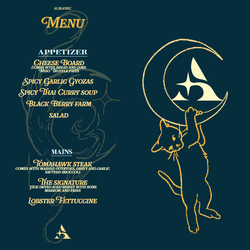
Rationale
Given just a name to start, we had complete creative control over the rest of the project, with the main guideline being to design a menu. From that, Almanec was born, a trendy cocktail lounge that embraces the idea of living fully in the moment. Its aesthetic is chic and high-end, with a vibrant space blending dark blue, yellow, and pops of pink to create a lively yet intimate atmosphere. Moody lighting paired with colorful furniture and expressive art makes every corner feel like an invitation to relax, connect, and indulge.
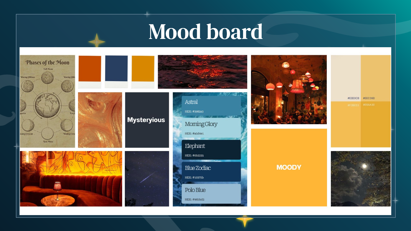
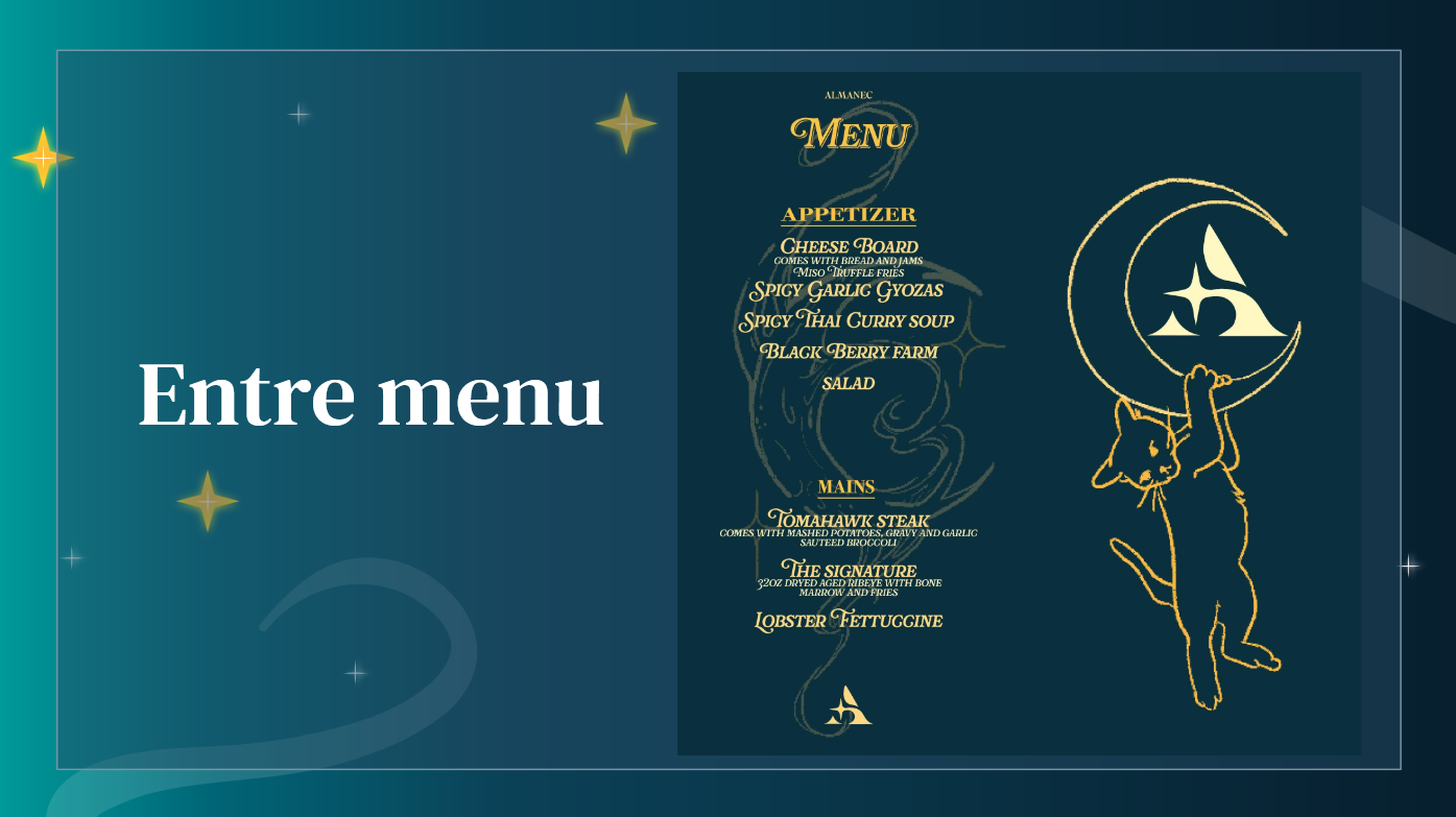
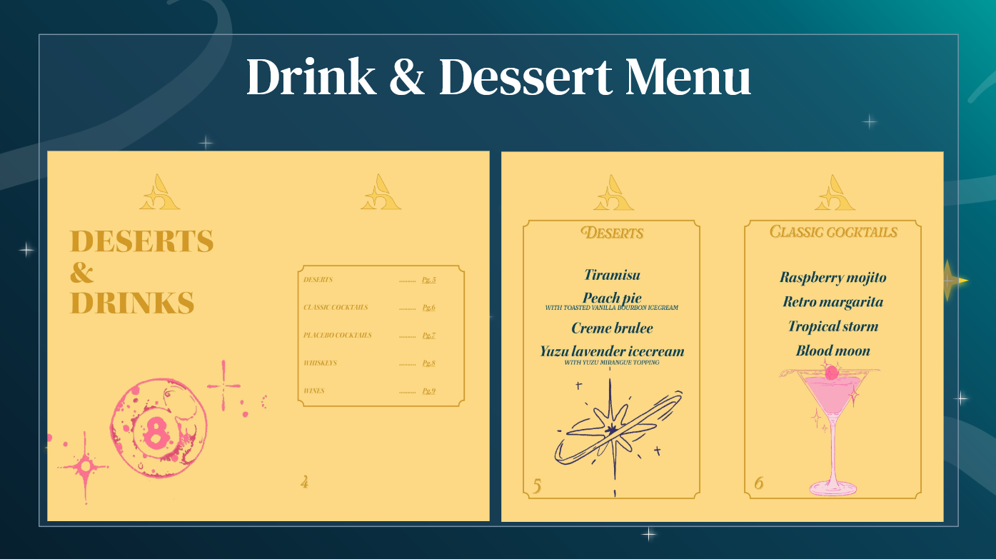
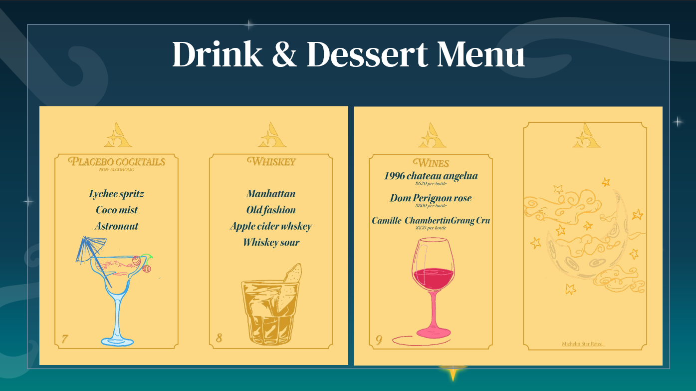
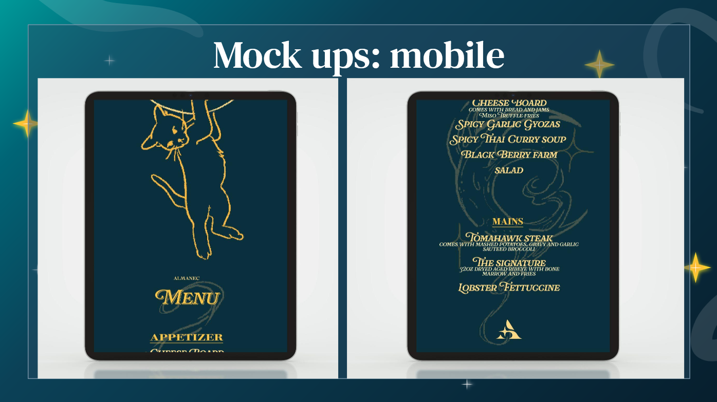
I began by creating a moldboard that captured the color palette, furniture, and overall vibe I envisioned for the space. The logo is a simple capital “A” , a choice made intentionally. I imagined the popularity of Almanec growing not through flashy branding or social media, but through word of mouth and personal storytelling. I wanted to reflect that sense of intrigue and discovery through the menu, making it a part of the overall experience.
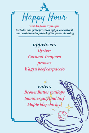
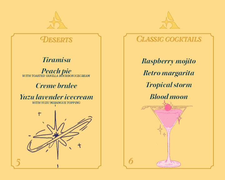
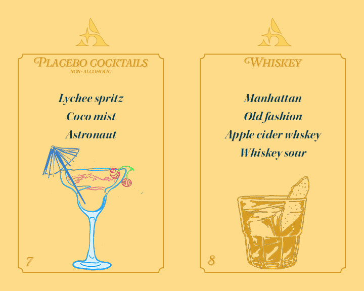
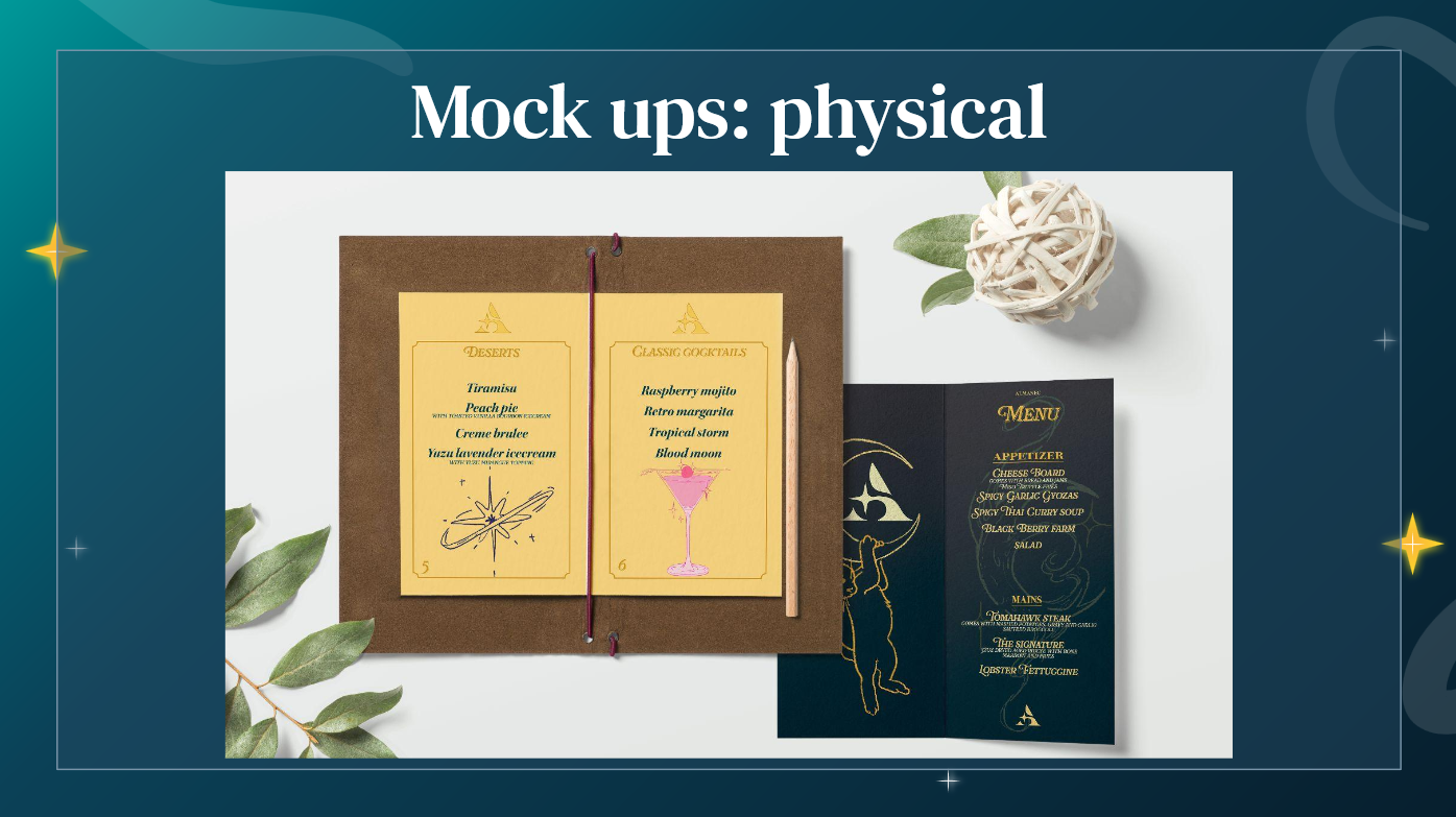
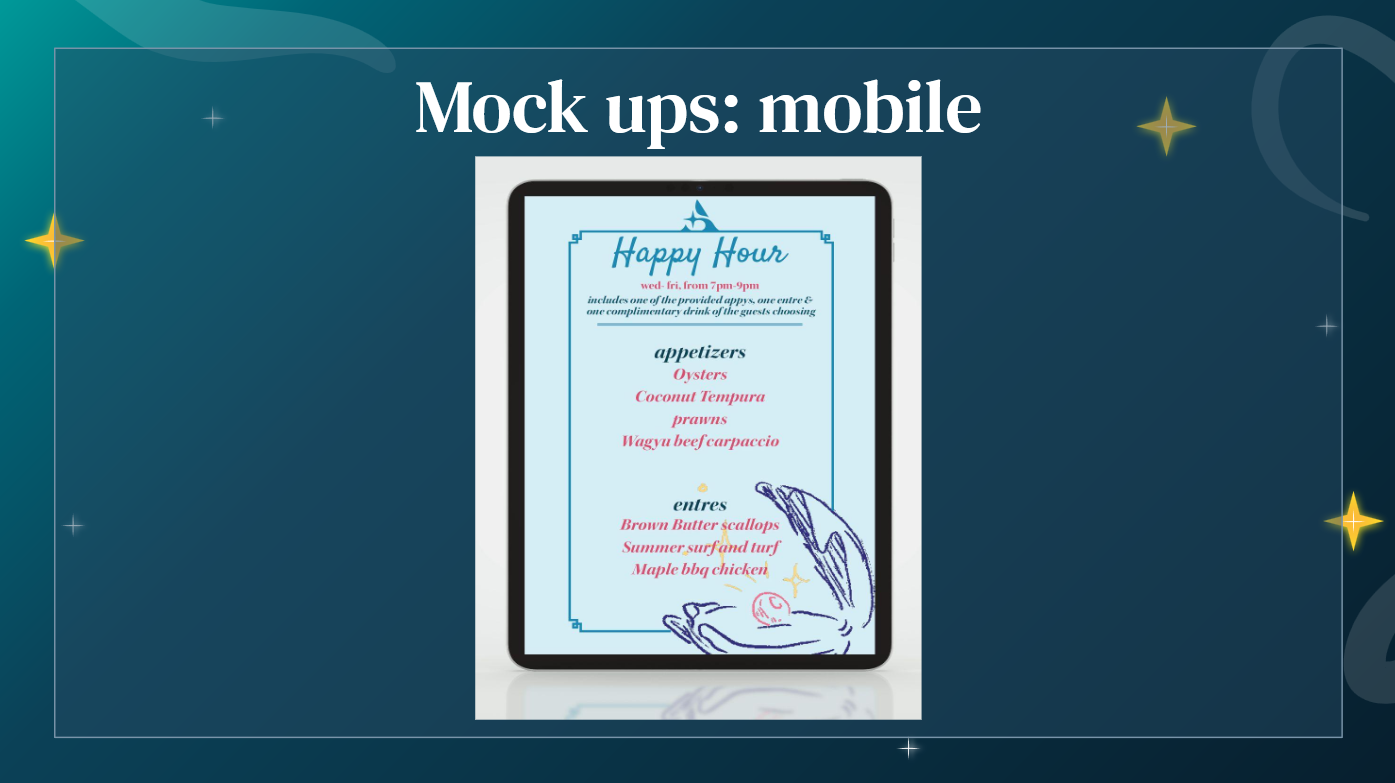
The physical menu is divided into two main parts, with a third card introduced during happy hour. My idea was to keep the food and drink menus clearly separate, both in layout and presentation. They could be given together on a styled clipboard or arranged in a way that highlights the drinks, as cocktails are the core focus of the lounge. The happy hour menu is a smaller, single-sided card that's placed on the table during that time of day, adding to the casual, in the know vibe.
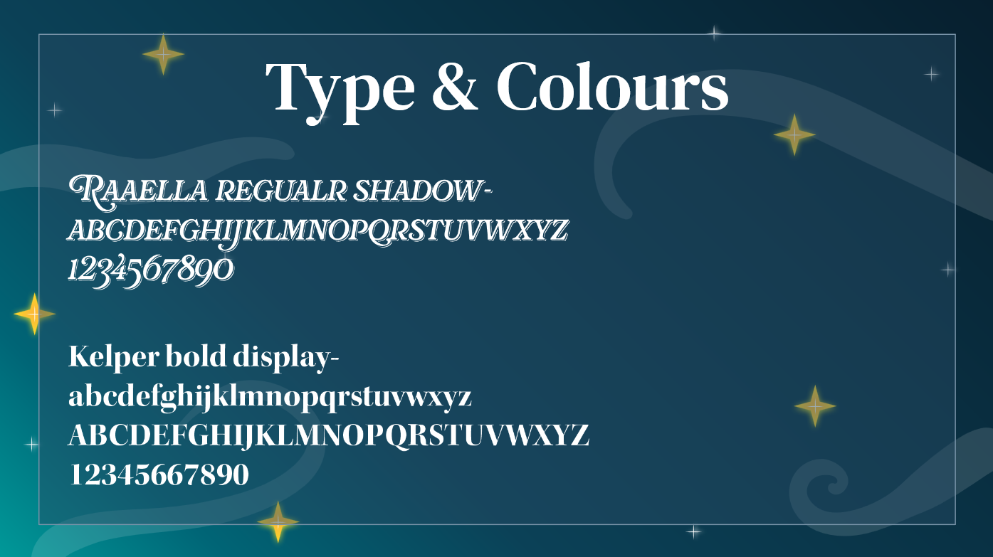
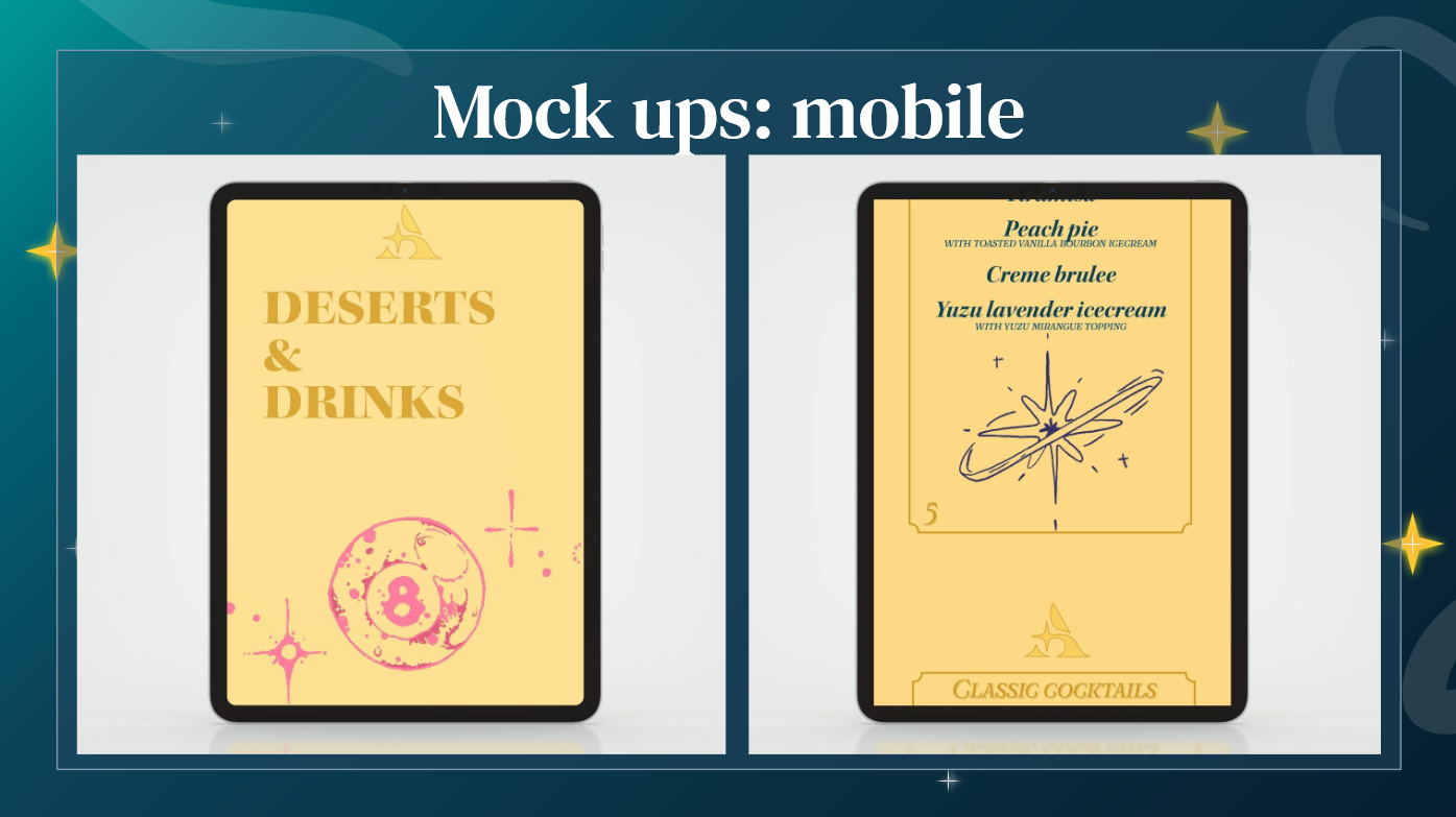
All the illustrations in the menu were created by me in Procreate, as a way to inject visual interest and reflect the fun, playful energy of the lounge. One of the main challenges I faced during the project was with type sizing and legibility, I ended up having to increase the font size across most of the text, which was unexpected. Other than that, the workflow was smooth, and I really enjoyed bringing this concept to life.


Flat Menu Design