Rationale
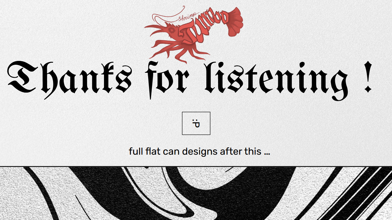
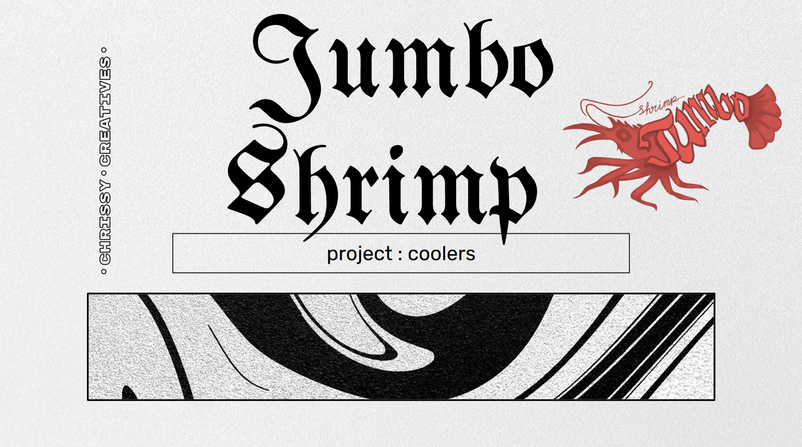
Jumbo Shrimp Drinks is a brand centered on experimentation, introducing new, bold, and unexpected flavors into the cooler market. This project was all about building a cohesive identity for a series of beverages under one brand. My focus was not just on flavor innovation, but also on making the brand stand out visually and conceptually in a saturated market.
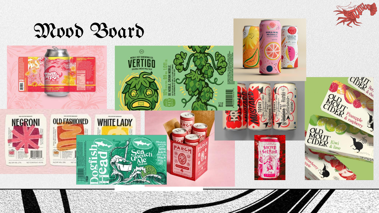
From the beginning, I wanted Jumbo Shrimp to be different. There are so many beverage options out there, and I felt like simply leaning on trendy aesthetics or popular flavor names wasn’t enough, it felt too safe and forgettable. At first, I explored names that were on-trend but quickly realized they lacked staying power and could easily blend in with the competition. I wanted a name that was playful, a little odd, and memorable, something that could create curiosity and spark conversation and after a lot of mix and match brainstorming, I narrowed it down to Rising Rooster and Jumbo Shrimp. Ultimately, Jumbo Shrimp felt more distinctive, and the contradiction in the name really captured the kind of quirky and fun personality I wanted the brand to have.
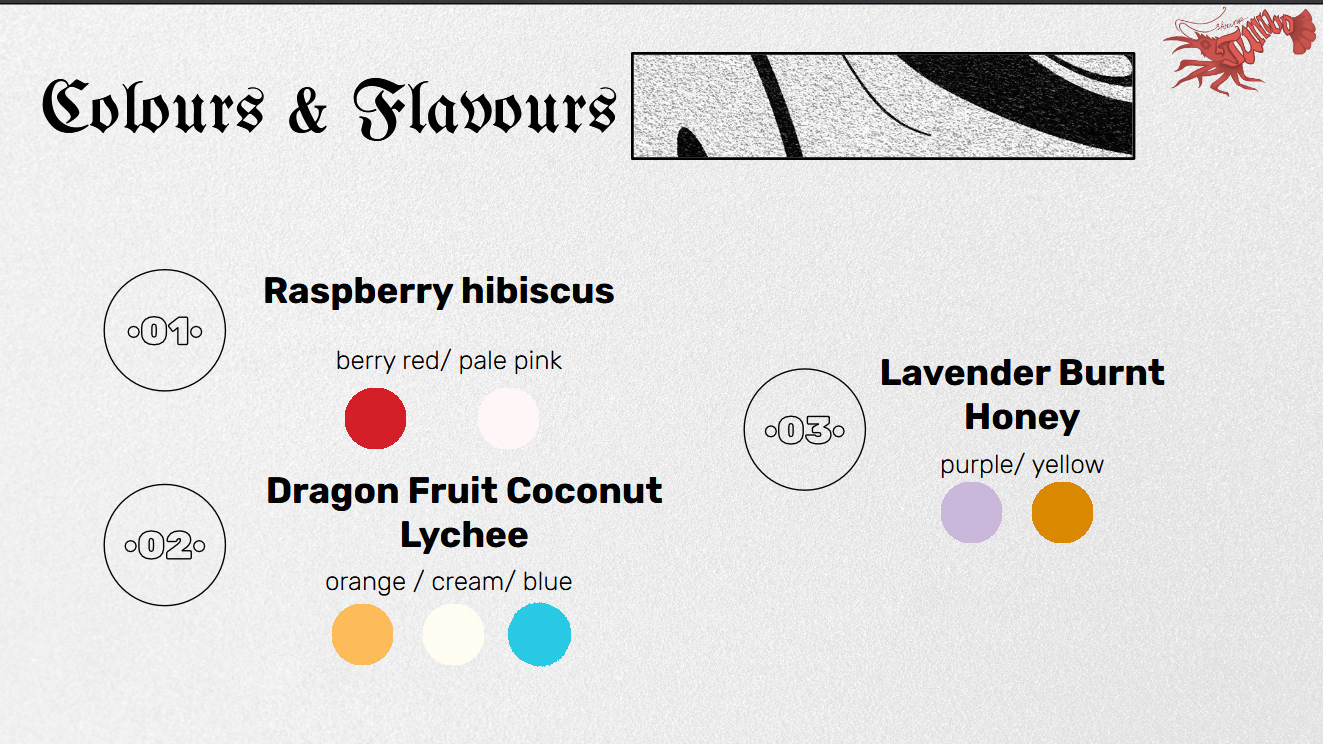
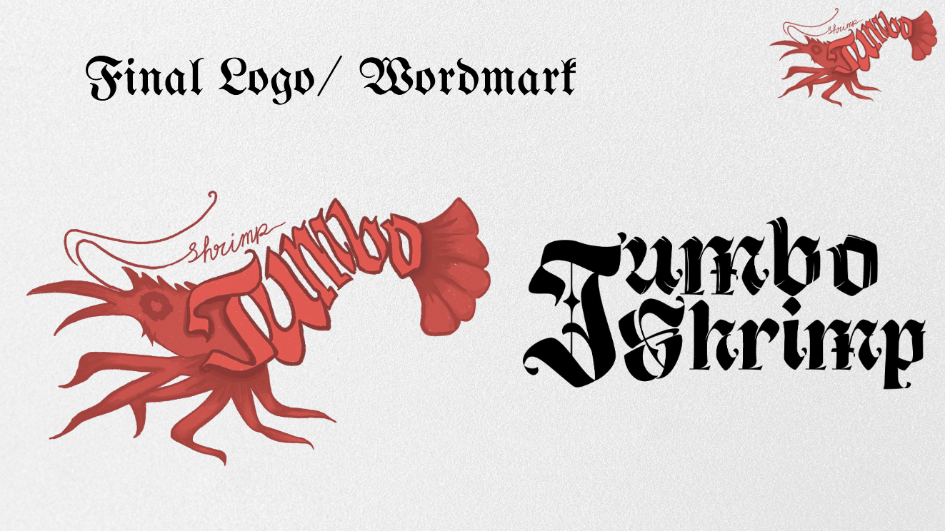
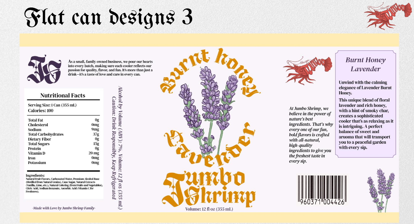
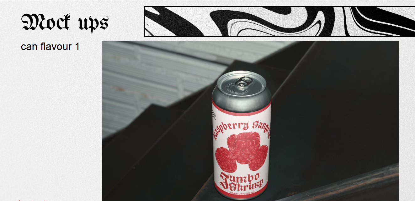
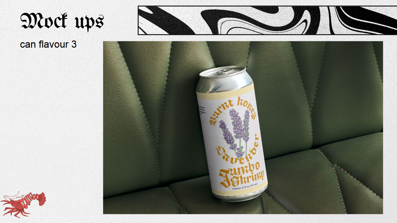
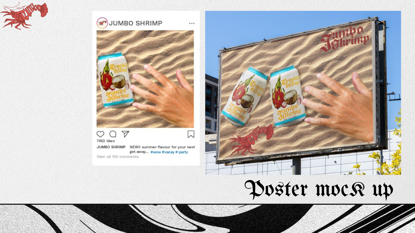
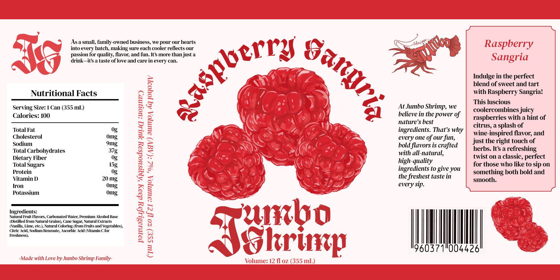
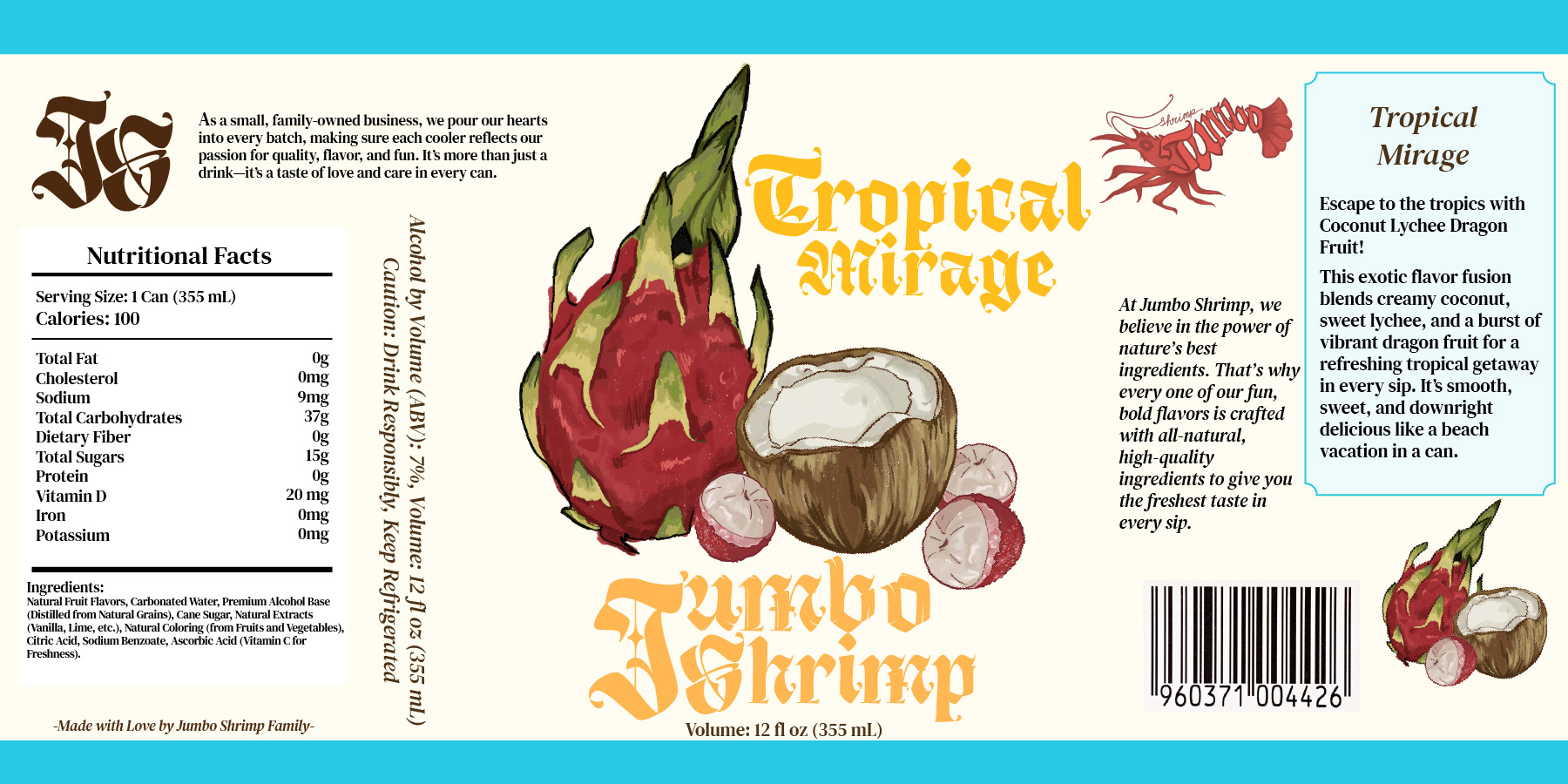
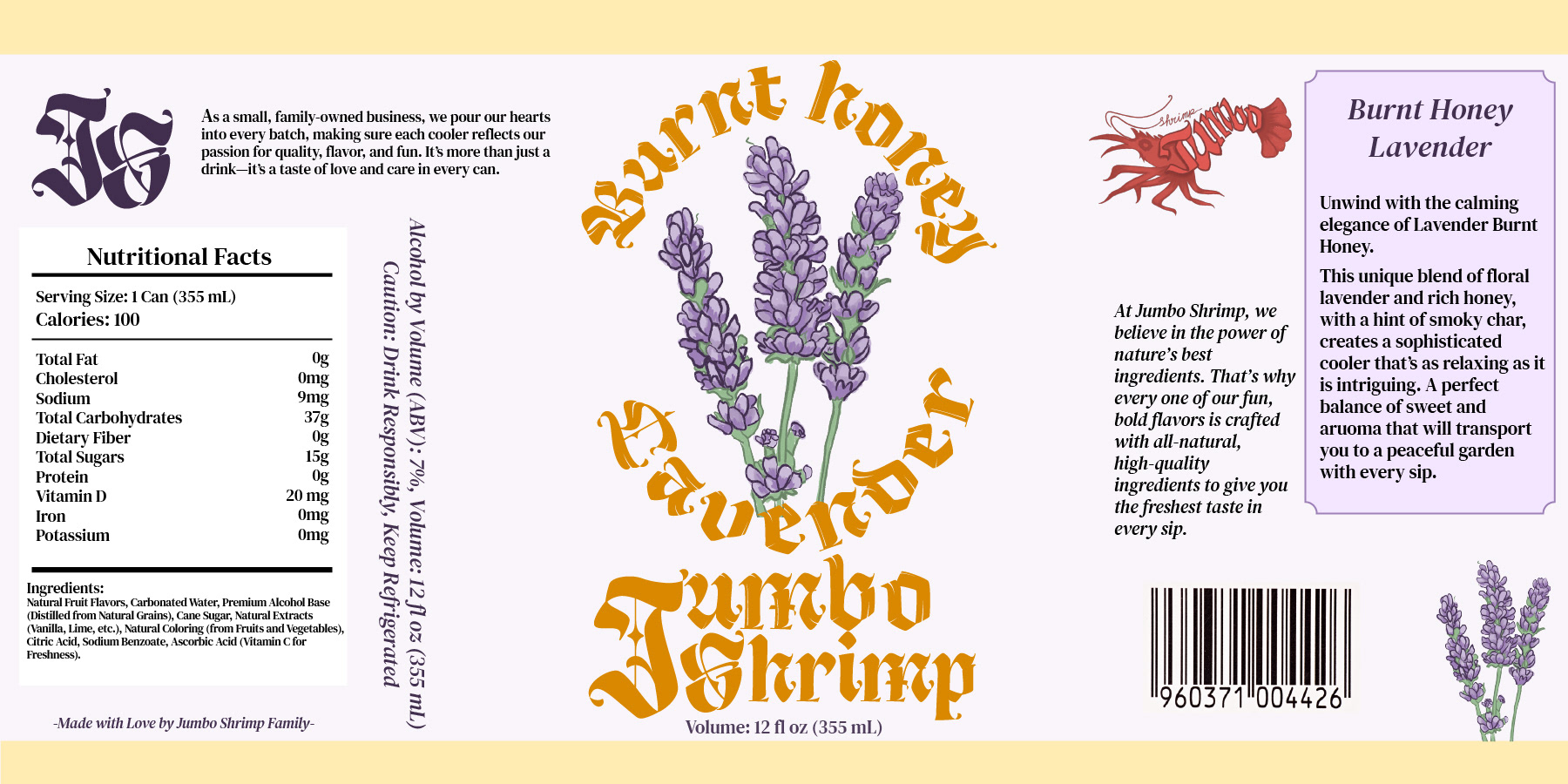
The design process started with logo development and typography exploration. I knew I wanted each flavor to have its own unique color palette, with the colors reflecting the personality and ingredients of each drink. I took a hands-on approach with the illustrations, hand-drawing all of the fruit and the logo myself using Procreate, inspired by the texture and look of colored pencils and oil pastels. This part of the project was definitely the most time-consuming, but also the most rewarding. I spent about a week using any spare moment I had to draw, refine, and really bring the illustrations to life. That tactile, imperfect quality of the illustrations gave the brand a kind of playful authenticity that I feel set it apart.
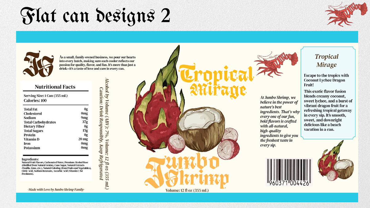
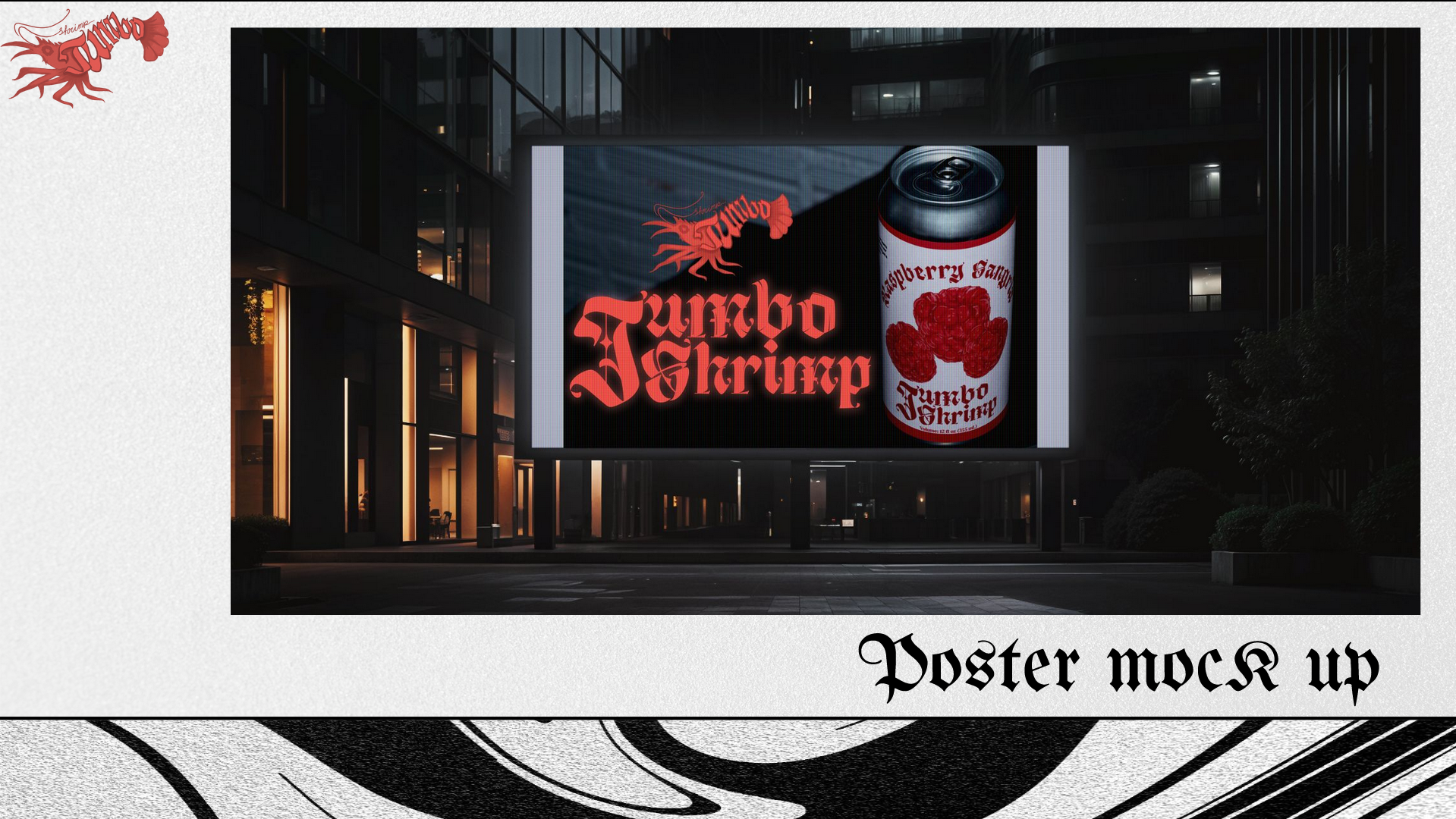
Once the illustrations were complete, I moved into Illustrator to create a bold, custom word mark that felt strong and modern. From there, I developed the can designs referencing real world packaging layouts from coolers and beers to ensure the designs felt believable and functional, while still standing out on shelves. I wanted the cans to feel fresh and eye catching, but also rooted in real branding standards, so I balanced the creative with the practical.
Looking back on this project, I felt incredibly connected to the process. It challenged me to take risks with my ideas and trust my instincts. The most satisfying part was seeing how everything came together, from the strange little name to the hand drawn fruit, to the final cans that looked like they could genuinely sit on a shelf next to mainstream brands. I loved having full creative freedom to experiment, and Jumbo Shrimp became a perfect reflection of that, unexpected, colorful, and a little weird in the best way.