Rationale
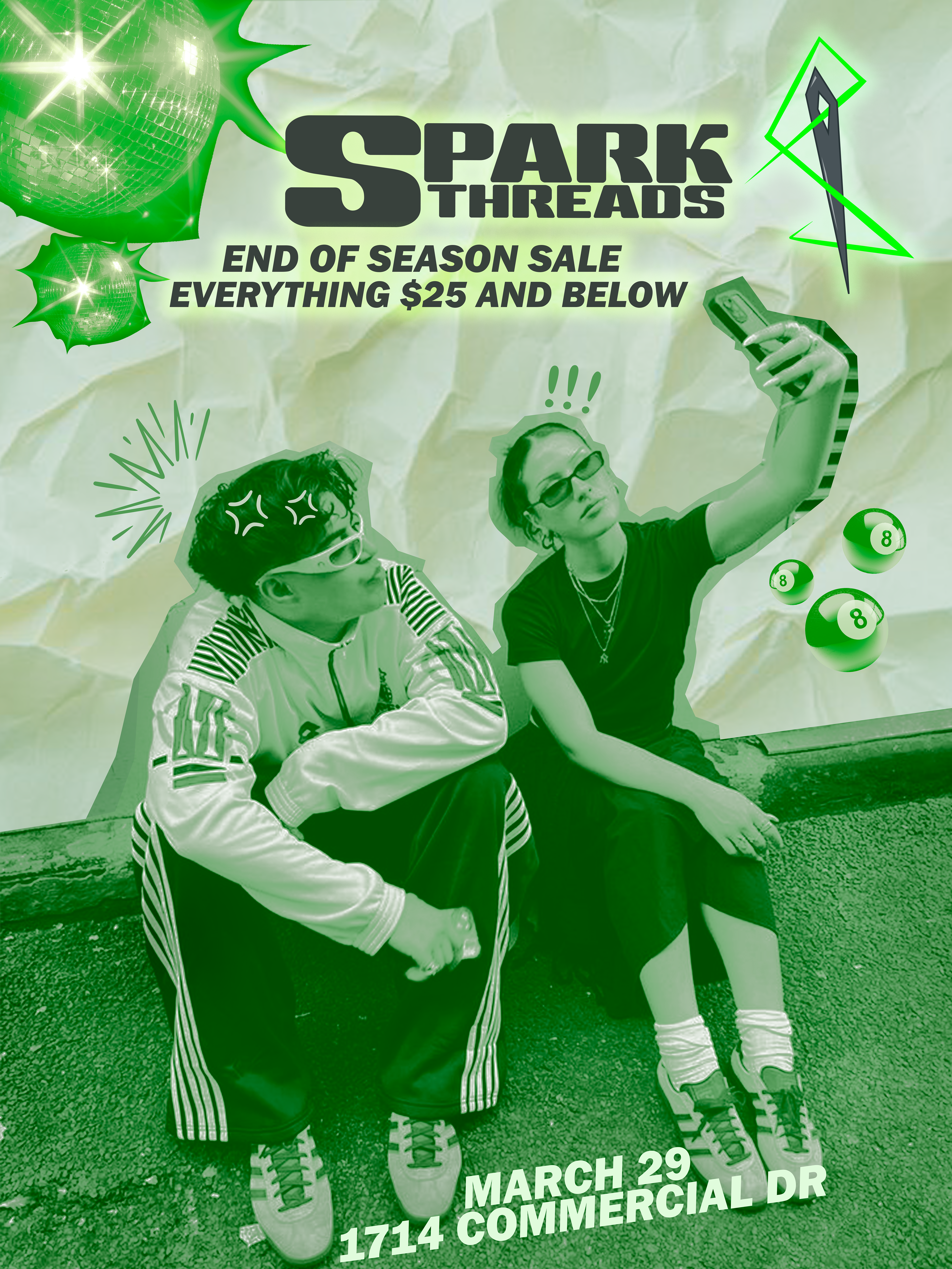
What began as a simple ad campaign to promote secondhand shopping and raise awareness about the pollution and waste caused by fast fashion quickly evolving into something much bigger. Initially, the focus was on composition and layout for a single poster, without the need to fully develop a brand or its backstory. So going back in and building out a complete brand identity based on that one poster was a bit of a challenge.
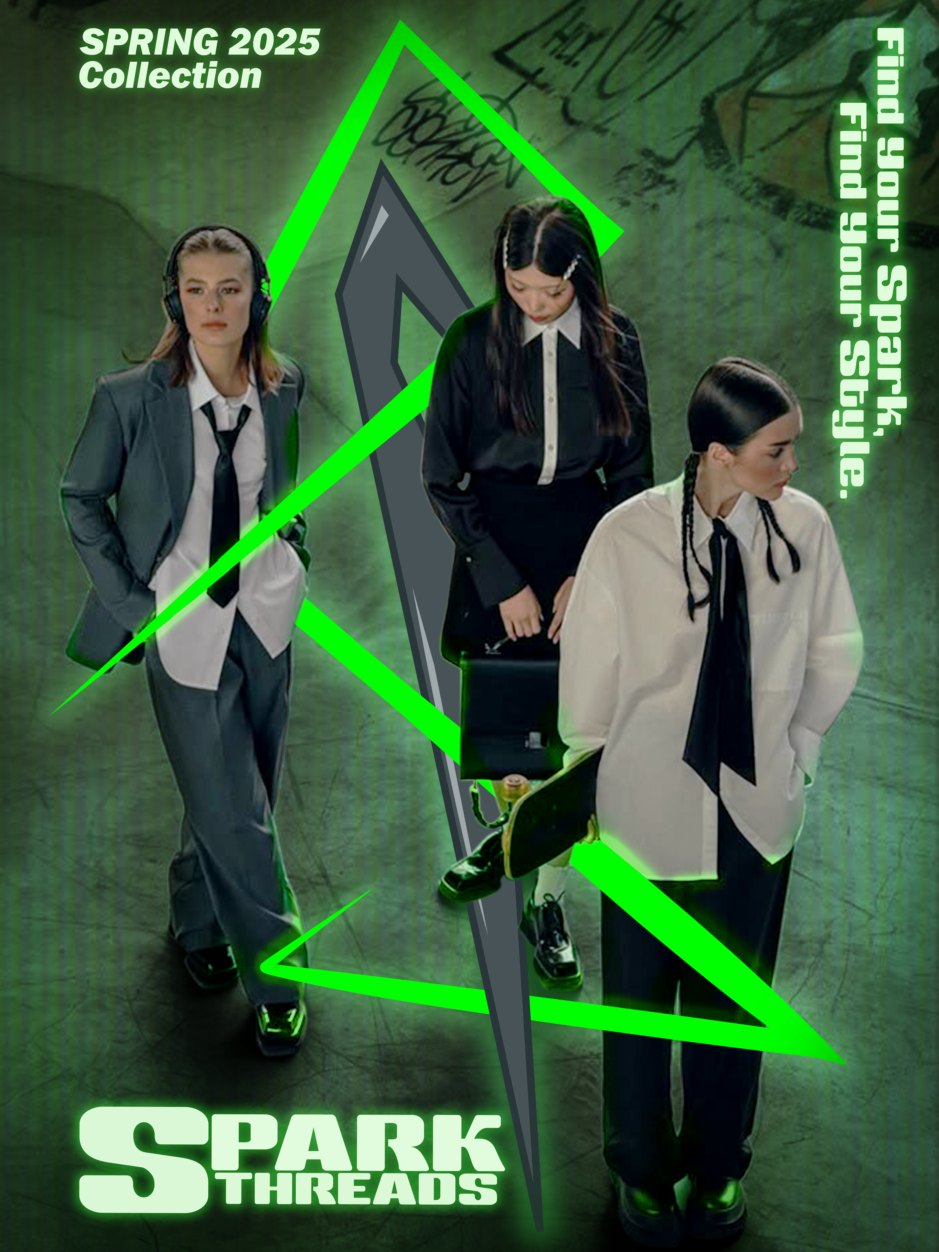
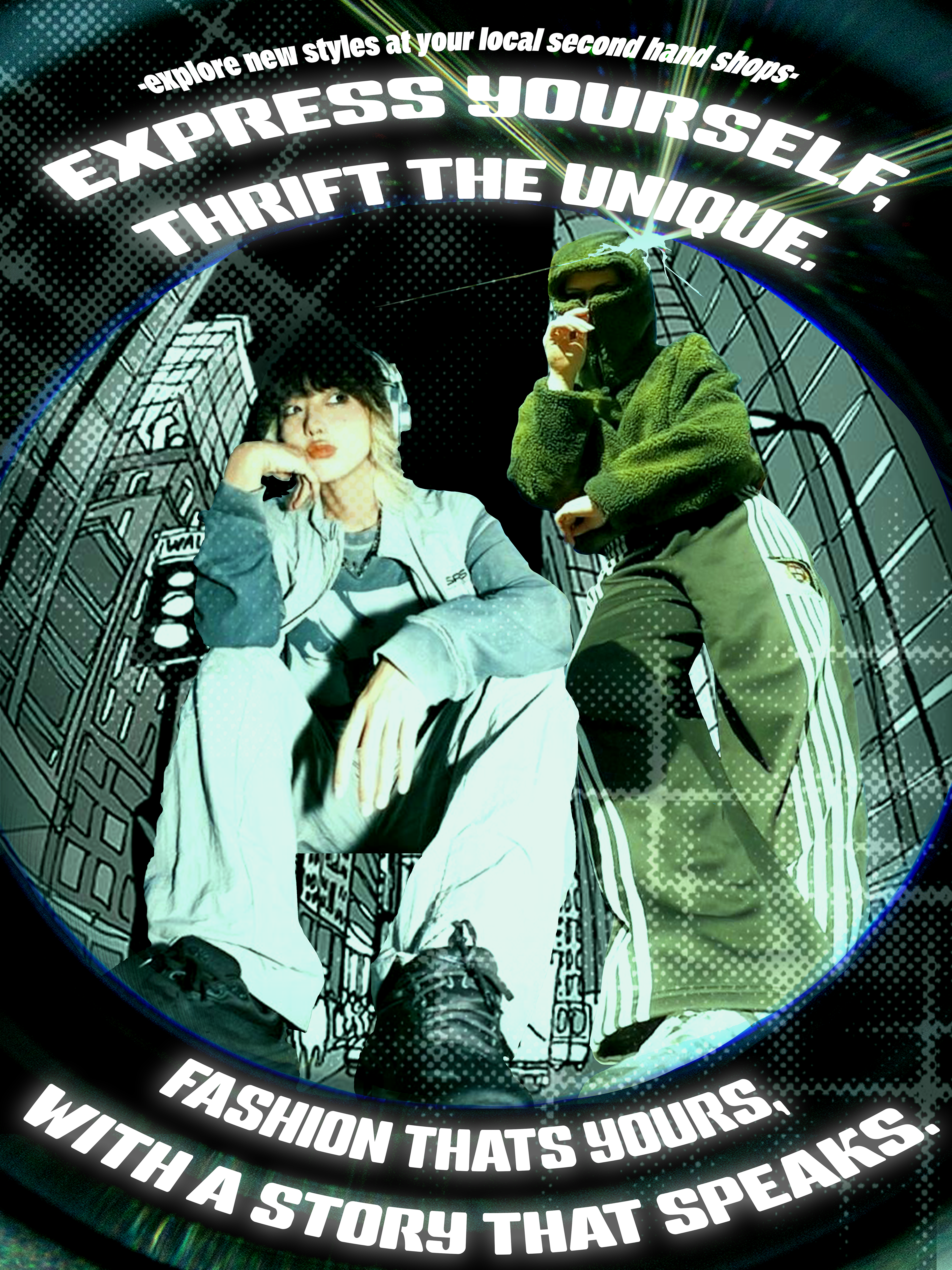
Working from the existing concept and aesthetic I had already established, I began by brainstorming potential brand names, color schemes, and logo ideas that would align with the visual direction of the first piece. From there, I created two additional posters/ads to complete the set. My goal was to not only show cohesiveness across all pieces, but also to demonstrate a range of styles and explore how far I could push creative boundaries, while still staying true to the brand's tone and guidelines.
My workflow typically starts with sketching and refining ideas, then moving into Adobe Illustrator to create vector versions of the logo, word mark, and any other graphic elements. The posters themselves were built in Photoshop, using layered and masked photography to craft visually engaging designs that work as standalone pieces and as part of a cohesive campaign.
Overall, this project was challenging, especially having to retroactively build a brand identity after designing the first poster without one in mind. There were definitely moments where I felt limited by that initial setup, and I often thought about different directions I could’ve taken if I’d started with a full concept. That said, I really enjoyed the creative process. Each poster turned out unique but still works well alongside the others. Playing with cutouts, textures, and different visual elements gave me a refreshing creative outlet, especially while juggling other projects at the same time.
All 3 posters


